


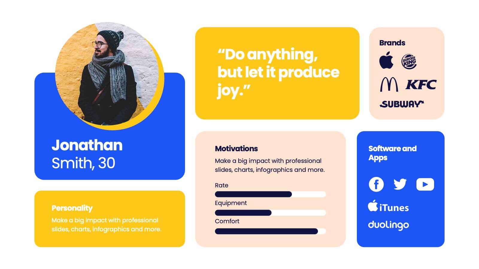
Features
- 12 Unique Slides
- Fully editable and easy to edit in Microsoft Powerpoint, Keynote and Google Slides
- 16:9 widescreen layout
- Clean and professional designs
- Export to JPG, PDF or send by email


Do you have any questions?
Recommend


7 slides
Strategic Matrix Comparison Framework Presentation
Easily compare business risks, priorities, or strategic choices with this matrix comparison framework. Featuring editable grids for mapping likelihood and impact, it’s perfect for decision-making and performance analysis. Highlight key categories using color-coded segments. Fully customizable and compatible with PowerPoint, Google Slides, and Keynote for professional presentations.


5 slides
Vegan Guide Infographics
A Vegan Guide is a comprehensive resource that provides information about a plant-based diet that excludes all animal products, including meat, dairy, eggs, and honey. These Vegan Guide Infographics are visual representations of information related to the vegan lifestyle. Cover a wide range of topics, including the benefits of veganism, how to transition to a vegan diet, common misconceptions about veganism, ethical and environmental considerations, and the nutritional requirements of a vegan diet. This can be used by individuals who are interested in adopting a vegan lifestyle, and educators who want to provide information about veganism to their clients and students.


7 slides
Buyer Infographic
Discover the power of visual storytelling with our dynamic Infographic Template, designed to bring the buyer's journey to life in full color and engaging detail! Each slide is a palette of opportunity, with bold hues and intuitive layouts that transform standard data into a compelling narrative. This template is a marketer’s dream, perfect for delineating complex buyer behaviors, demographics, and decision processes in an easily digestible format. It leverages striking graphics and concise text to illuminate key insights that drive consumer actions, making it indispensable for presentations, reports, or online content. Customize to your heart’s content, adjusting colors, fonts, and layouts to align perfectly with your branding. Whether you're detailing market trends, consumer feedback, or purchase patterns, this template ensures your data not only informs but also inspires. Ideal for strategists, sales teams, and marketers, it's your secret weapon in crafting stories that not only tell but also sell.


6 slides
Remote Learning and Virtual Classrooms Presentation
Visualize the modern classroom experience with this six-step layout centered around a laptop graphic. Each point is displayed in a colorful speech bubble, making it perfect for showcasing online learning tools, virtual engagement strategies, or course delivery methods. Ideal for educators, trainers, and e-learning professionals, this slide is fully editable and works seamlessly in PowerPoint, Keynote, and Google Slides.


5 slides
Company History and Growth Timeline Presentation
Present your milestones with clarity using the Company History and Growth Timeline presentation. Ideal for startups, enterprises, and project retrospectives, this timeline layout helps you highlight key achievements, growth phases, and expansion years in a visually structured format. With modern design elements, editable text fields, and dynamic year markers, it's perfect for telling your brand story or progress journey. Fully compatible with PowerPoint, Keynote, and Google Slides.


8 slides
Digital Payment and Credit Solutions Deck Presentation
Present your financial strategies with clarity using this Digital Payment and Credit Solutions Deck Presentation. Designed to highlight key service features and fintech insights, this layout visually compares digital cards, credit options, or payment tiers. Perfect for banks, startups, and financial analysts. Fully editable in PowerPoint, Keynote, and Google Slides.


8 slides
Yearly Calendar Planning Presentation
The "Yearly Calendar Planning" presentation template is designed to help visualize task progress over a 12-month period. Each row represents a specific task, labeled as Task 01 through Task 04, with each month represented by a square. The color coding—orange for "Done", gray for "In Progress", red for "Revision", and yellow for "Hold On"—provides a clear visual status of each task's progress. This template is ideal for project managers and team leads who need to track and report on the status of multiple tasks over the course of a year, ensuring a comprehensive view of project timelines and milestones.


5 slides
Construction Equipment Infographics
Dive into the industrial world with our construction equipment infographics template. This collection, rich with vivid reds, greens, and purples, breaks down intricate machinery details into digestible visual content, perfect for professionals in the construction industry, equipment manufacturers, and trade school educators. Compatible with Powerpoint, Keynote, and Google Slides. The creative, vertical style packed with high-quality graphics and icons, facilitates the easy assembly of data and processes, enhancing presentations, or educational content. Equip yourself to convey the dynamism of construction equipment through this visually compelling tool.
12 slides
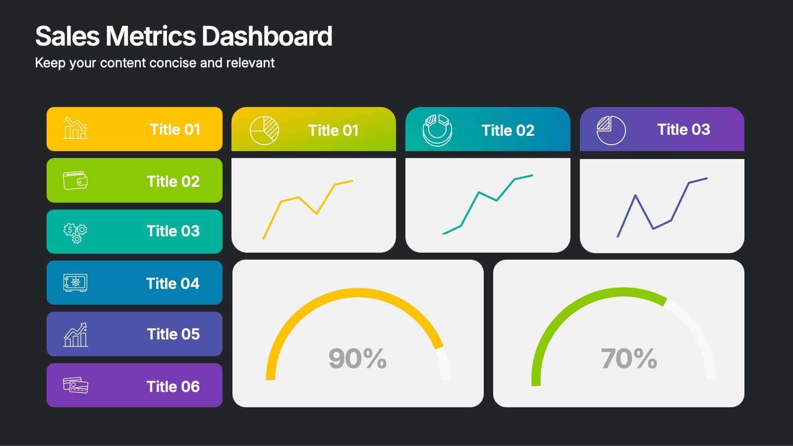
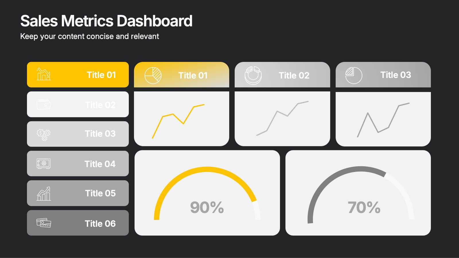
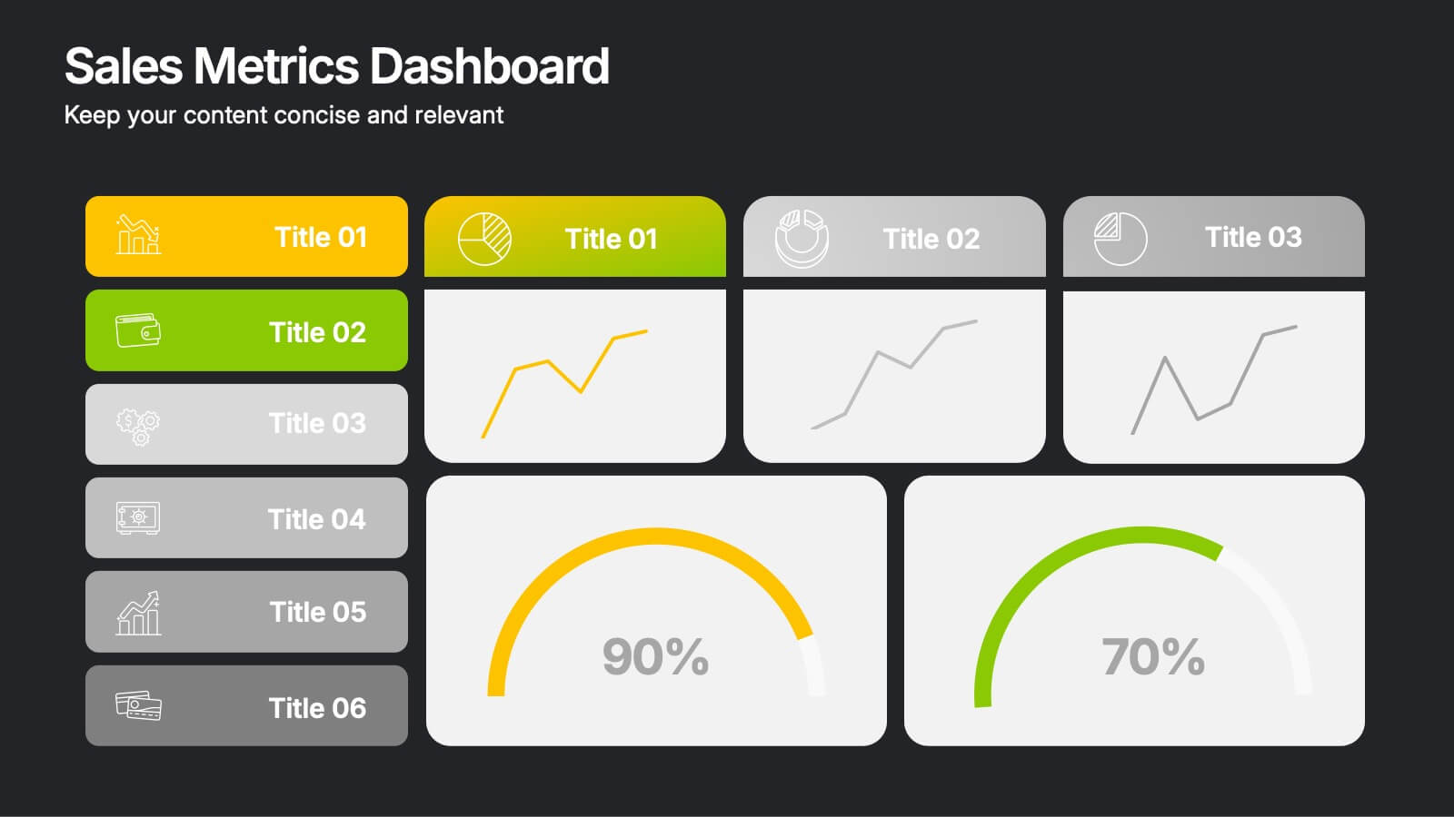
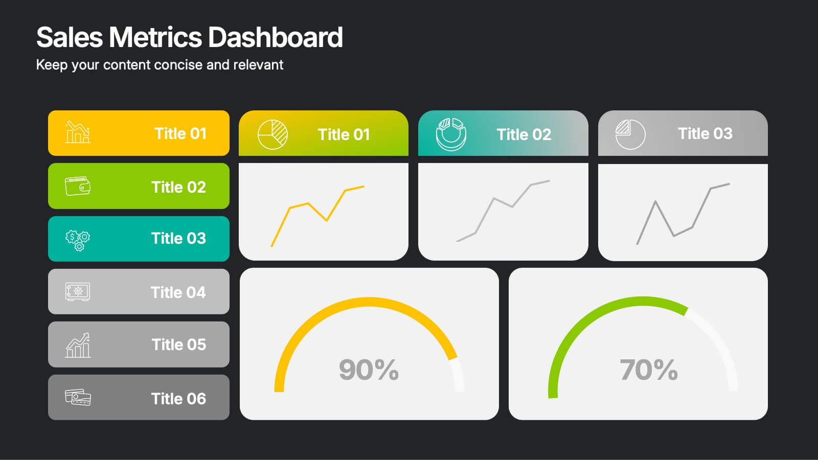
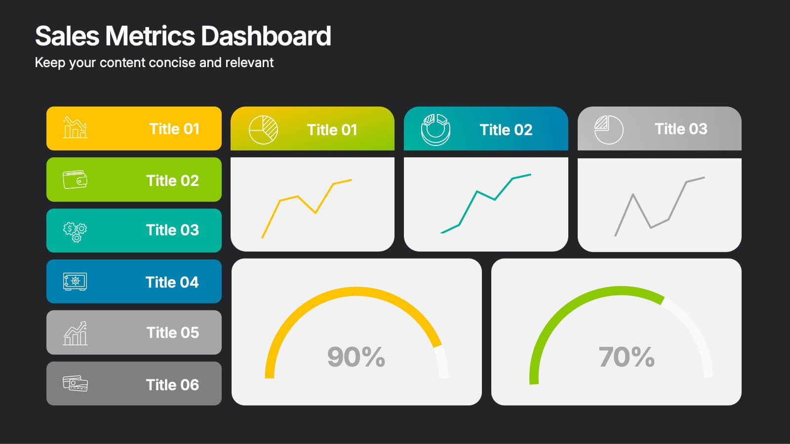
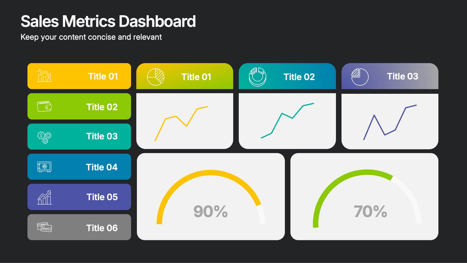
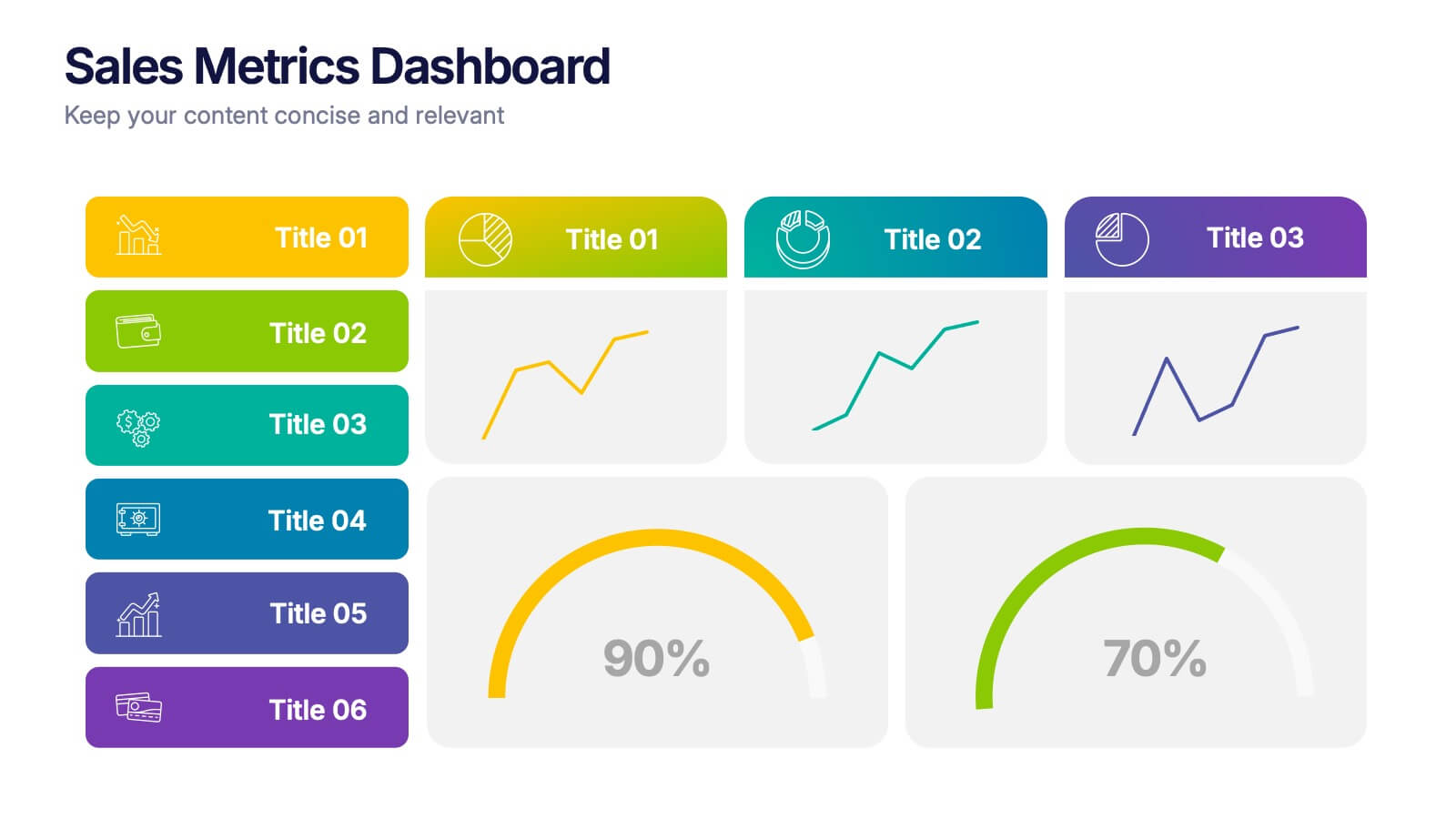
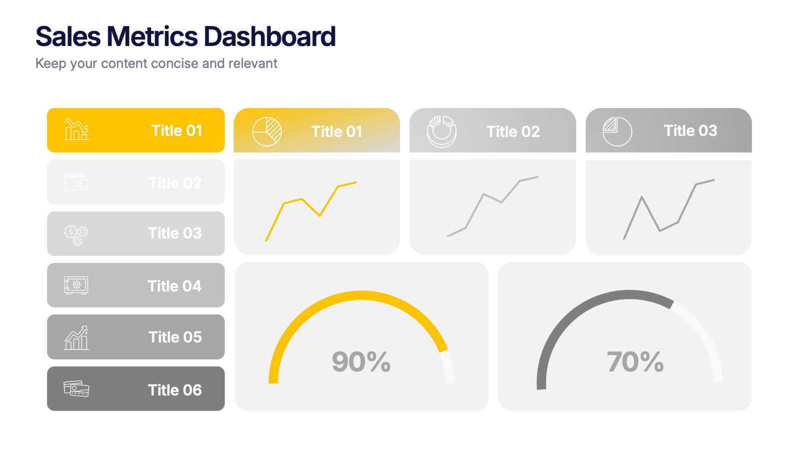
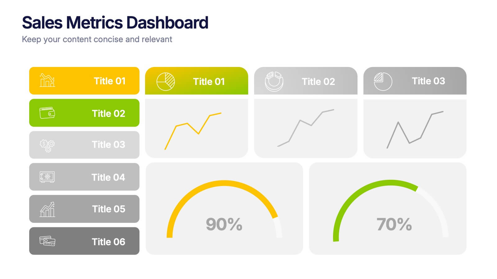
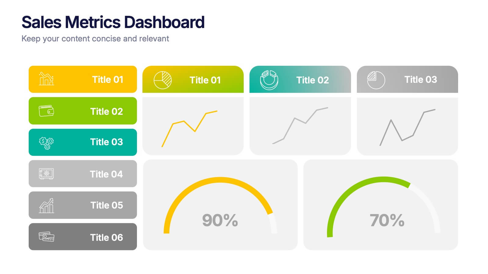
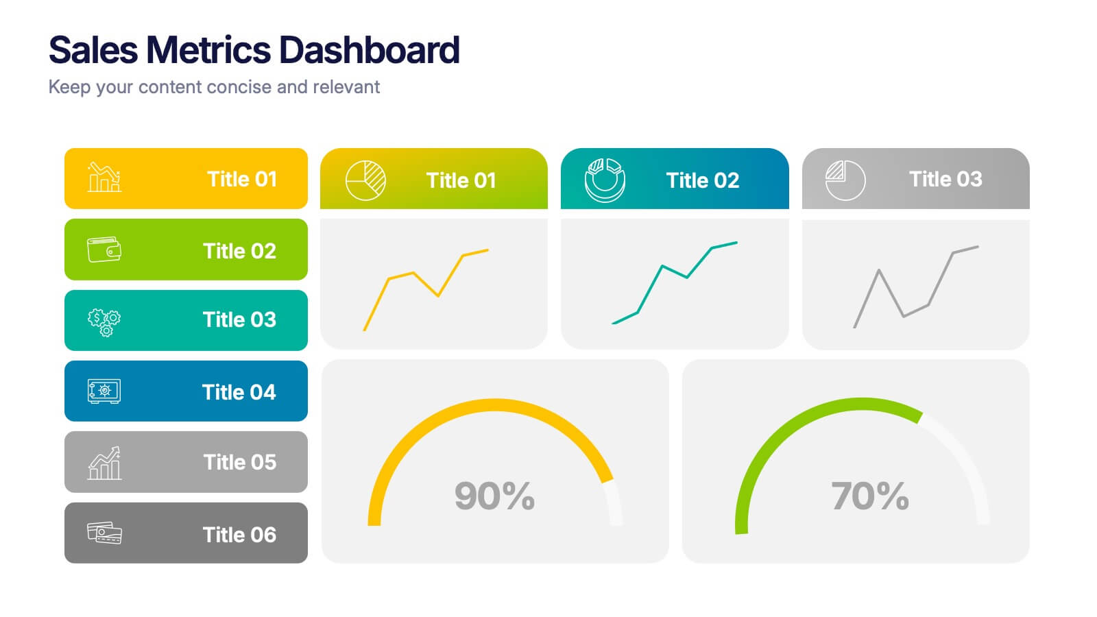
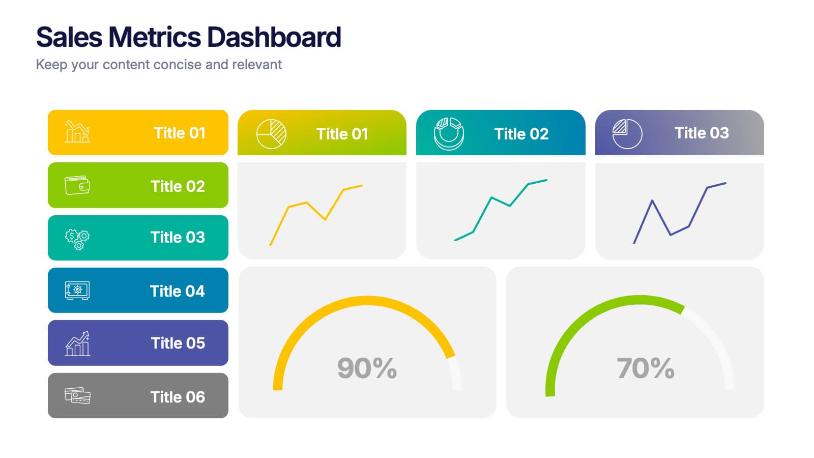
Sales Metrics Dashboard Presentation
Unlock a sharper view of your sales story with a clean, data-driven layout that highlights performance trends at a glance. This presentation organizes KPIs, charts, and progress indicators into an easy-to-follow dashboard that supports smarter decision-making. Fully compatible with PowerPoint, Keynote, and Google Slides.


26 slides
World History and Geography Presentation
Step back in time with this richly detailed presentation template designed for exploring the vast landscapes of world history and geography. This template combines elegant, vintage-inspired design elements with practical, educational layouts, making it perfect for history teachers, academic researchers, and cultural enthusiasts who wish to convey the chronology and impact of historical events and geographical discoveries. The slides are infused with historical images, maps, and artifacts that not only enhance visual appeal but also aid in the storytelling process, providing a vivid backdrop for each topic discussed. From ancient civilizations to modern boundaries, the template allows for a comprehensive overview of human development across the globe. It includes timeline infographics for sequential narration, comparison slides for side-by-side analysis of different regions, and detailed charts for demographic and geographical data. Fully compatible with PowerPoint, Keynote, and Google Slides, this template is customizable, allowing presenters to tailor their message while maintaining a professional and engaging aesthetic. It is an invaluable tool for anyone looking to create a compelling educational experience that highlights the interplay between human history and the geographical stage upon which it unfolds.


7 slides
Watercolor Plan Infographic
A watercolor plan infographic refers to an infographic design or style that incorporates elements of watercolor painting. Dive into the world of dreams and aspirations with our watercolor plan infographic template. This artistic and visually captivating infographic guides you through your plans and goals with the fluidity and creativity of watercolors. This infographic is a visually stunning and inspiring template that transforms the process of goal setting into an artistic masterpiece, encouraging individuals to paint their dreams with vivid hues of determination and creativity.


26 slides
Software Engineer Career Development Presentation
Chart a course for success with our software engineer career development presentation template, designed for aspiring and established software engineers. This colorful, creatively illustrated template provides an exceptional backdrop for career milestones, educational paths, skill-building strategies, and emerging industry trends. Compatible with Powerpoint, Keynote, and Google Slides. Whether you're exploring the software realm, a career counselor orchestrating guidance sessions, or a seasoned professional mentoring newcomers, this comprehensive tool is your gateway to enriched understanding and discussion in the dynamic world of software engineering.


26 slides
Human Anatomy Medical Research Presentation
Introducing the vibrant Human Anatomy Research Presentation Template - a brilliant tool to explore the fascinating world of the human body. With a palette of lively colors, this template comes to life, making complex medical concepts accessible and engaging. This exceptional template includes a range of icons and illustrations related to human anatomy. These visual elements serve as the perfect complements to your content, enriching your presentation and making it more comprehensible. The Human Anatomy Research Presentation Template is designed to work seamlessly with PowerPoint and Google Slides. This compatibility offers you the flexibility to choose the platform that suits your style the best. The key to a great presentation is clarity and accessibility. This template's colorful design and comprehensive anatomical icons and illustrations achieve just that, breaking down complex ideas into digestible content that resonates with your audience. And don't worry about customization. This template is as flexible as it gets. All you need to do is adjust the content to match your research, and you're ready to captivate your audience with an enlightening presentation. So, don't wait up! Download the Human Anatomy Research Presentation Template today. It's colorful, illustrative, and compatible with PowerPoint and Google Slides - the perfect choice for i....


8 slides
Business Workflow Process
Showcase your operations with this 4-step business workflow diagram. Designed for clarity and adaptability, each step features icons and text fields ideal for processes, pipelines, or phase breakdowns. Fully editable in PowerPoint, Keynote, and Google Slides—customize effortlessly to fit your business needs.


7 slides
Problem Solution Infographic
The Problem Solution Infographic is a versatile template designed to clearly articulate challenges and corresponding strategies. It guides viewers through a sequence of problem identification to the implementation of solutions, offering a structured approach to problem-solving. This template is perfect for professionals who aim to present issues and their solutions in a logical, step-by-step manner. With its compatibility across PowerPoint, Google Slides, and Keynote, this tool is ideal for workshops, business meetings, academic environments, or any scenario where clear communication of problem-solving is required.


5 slides
Essential Education Infographics
Education is a key driver of individual and societal progress, and investing in education is essential for building a better future for all. This vertical infographic template is designed for educators, trainers, and other professionals who want to create informative and visually appealing educational materials. The theme of the template is centered around education, with bright and colorful illustrations of books, pencils, and other educational tools. Compatible with PowerPoint, Keynote, and Google Slides. Each slide is fully editable, allowing you to easily change the colors, fonts, and content to suit your needs.


26 slides
World Environment Day Presentation Template
Celebrate sustainability and inspire action with this vibrant presentation template designed for World Environment Day. Perfect for educators, environmental advocates, or event organizers, this template provides a dynamic platform to raise awareness about pressing ecological issues and promote solutions. It includes sections for discussing environmental challenges, presenting data on climate change, showcasing community initiatives, and sharing actionable tips for sustainable living. Featuring eco-friendly visuals, green tones, and clean layouts, it keeps your audience engaged while conveying the importance of environmental responsibility. Infographics, charts, and timelines make complex data accessible and impactful, helping you deliver a compelling message. Fully customizable, this template adapts to a variety of topics, from global conservation efforts to local green projects. Compatible with PowerPoint, Keynote, and Google Slides, it ensures your presentation is professional and effective on any platform, empowering you to make a difference for the planet.